


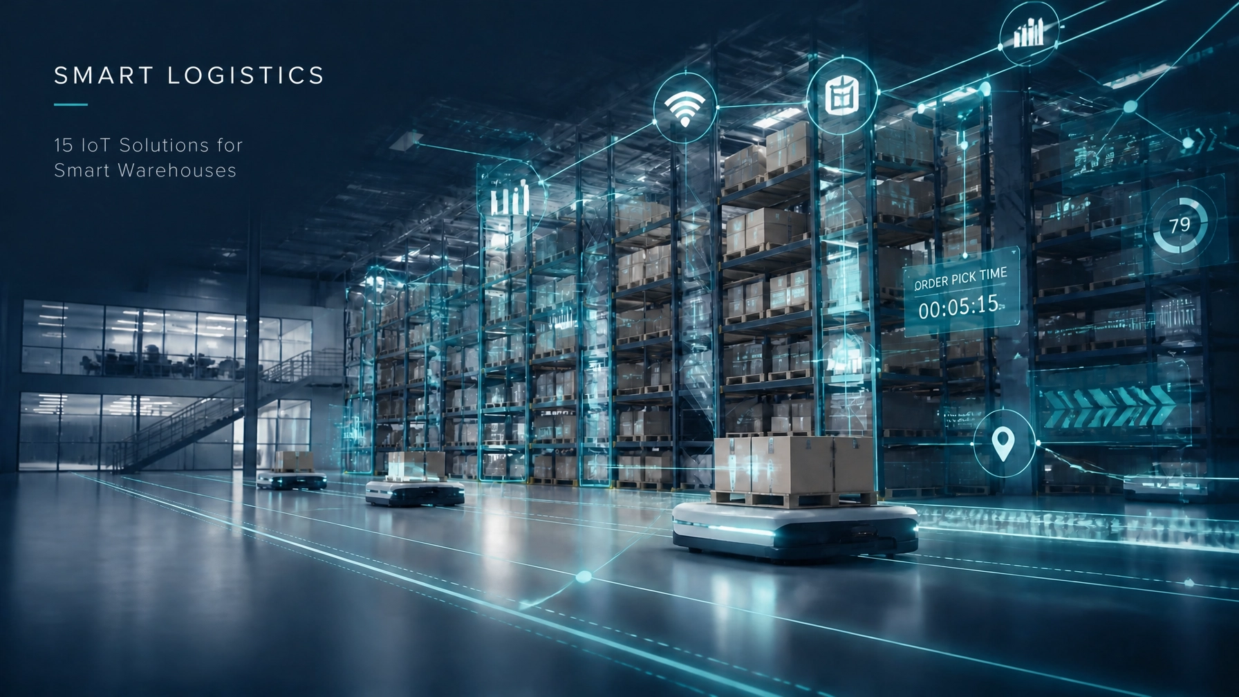
15 IoT Solutions for Business to Transform Your Smart Warehouse Operations
In the rapidly evolving landscape of global logistics, the traditional warehouse is no longer just a storage facility; it has

IoT Solutions for Business: 10 Things to Know Before Hiring Engineers
The landscape of IoT solutions for business has undergone a radical transformation. As we move through 2026, the Internet of
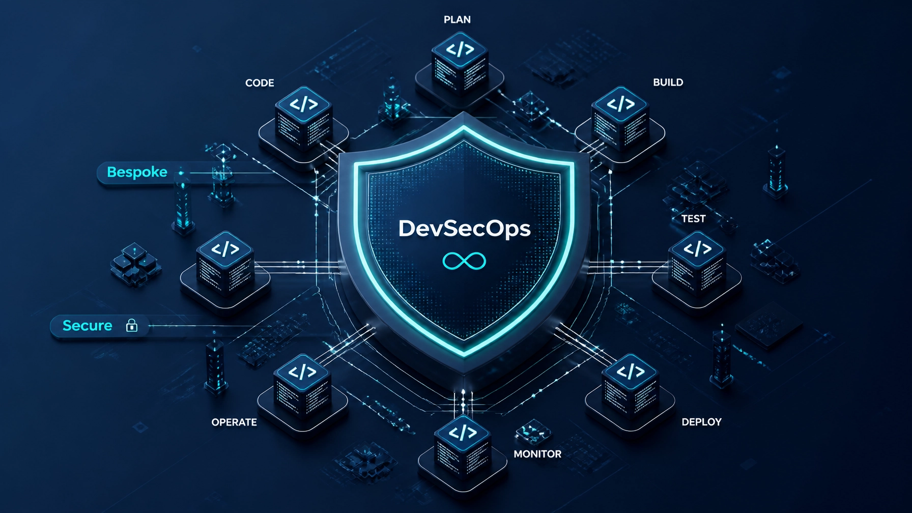
Why DevSecOps is a Must for Bespoke Software Development in 2026
In the rapidly evolving digital landscape of 2026, the traditional boundaries between development and security have not just blurred, they

15 IoT Solutions for Business to Transform Your Smart Warehouse Operations
In the rapidly evolving landscape of global logistics, the traditional warehouse is no longer just a storage facility; it has
IoT Solutions for Business: 10 Things to Know Before Hiring Engineers
The landscape of IoT solutions for business has undergone a radical transformation. As we move through 2026, the Internet of
Why DevSecOps is a Must for Bespoke Software Development in 2026
In the rapidly evolving digital landscape of 2026, the traditional boundaries between development and security have not just blurred, they